Market Structure
The Market Dynamics Pro Toolkit offers market structure analysis indicators through BOS/CHoCH analysis.
A valid break of structure occurs when the market moves in either an uptrend or a downtrend, forming a structure. This happens when a market high or low is locally broken, as explained on this page.
Volume Analysis
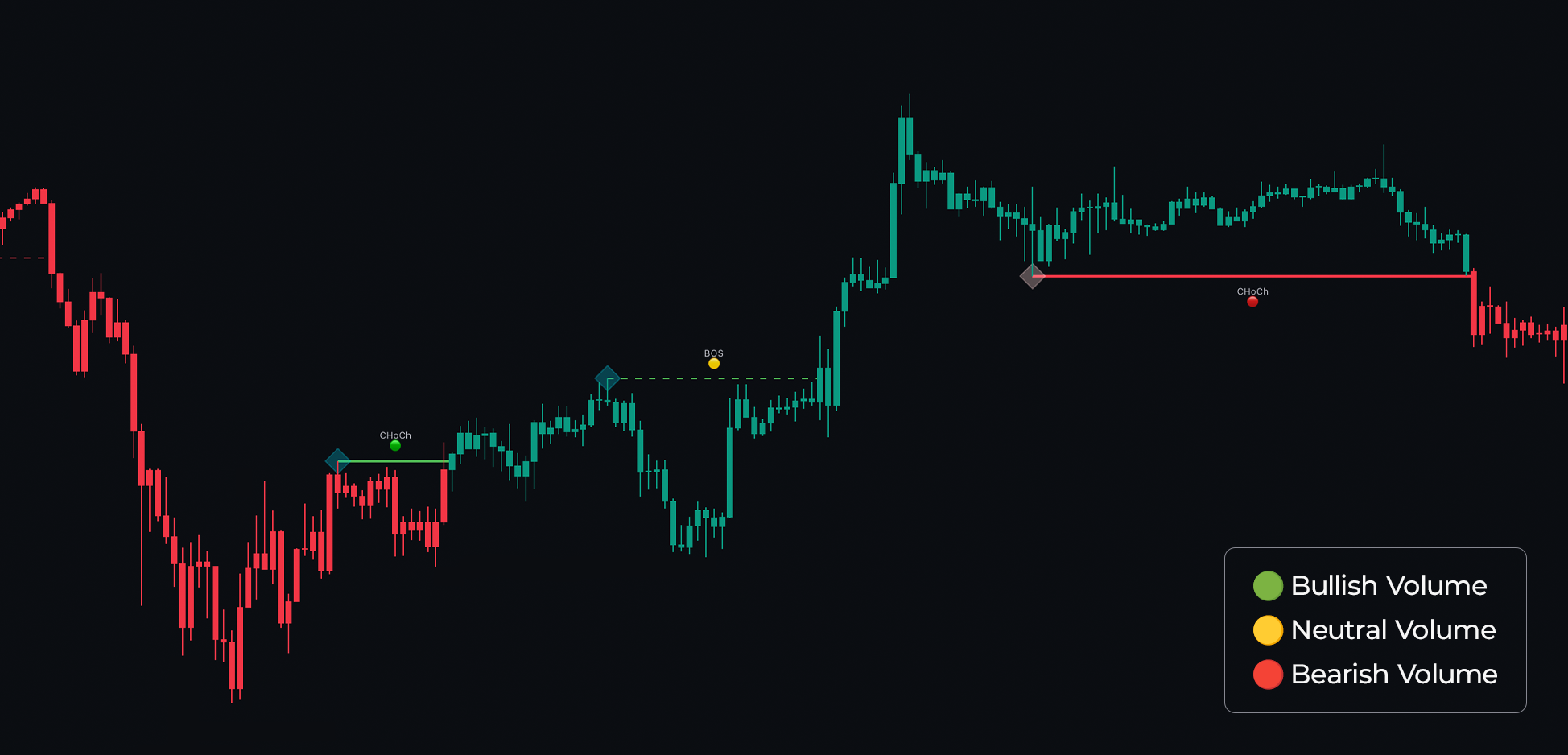
The Market Dynamics Toolkit enhances this analysis by providing volume insights on these breaks, helping traders assess the strength of the break. These are displayed as colored circles above the break label: a red circle indicates bearish volume, a yellow circle suggests neutral volume, and green circles indicate bullish volume. Identifying confluence at these breaks can be an excellent analytical approach.
There are two types of market structures labeled in Market Dynamics Pro: BOS and CHOCH.
A BOS (Break Of Structure) is a continuation pattern. When a BOS appears, it suggests that the market will continue in the indicated direction. For example, a BOS in an uptrend indicates that the uptrend is likely to persist, as the previous higher high or lower low has been broken.
A CHOCH (Change Of Character) is a reversal label. This occurs when the market breaks a higher low or a lower high, indicating a shift in the market’s character or attitude. Blue diamonds represent a bullish structure, while red diamonds indicate a bearish structure.
Looking for these green dots can help you identify stronger market breakouts and avoid fakeouts.
As mentioned, a CHoCH occurs when the market reverses direction due to breaking a higher high or lower low, as demonstrated below:
 |
|---|
| Volume Dots with Market Structure |
Most importantly, ChartPrime provides volume analysis on these formations, enabling traders to distinguish between a genuine reversal and a weak “fake reversal.” This helps traders avoid taking profits too early or flipping their biases.
Extra Data
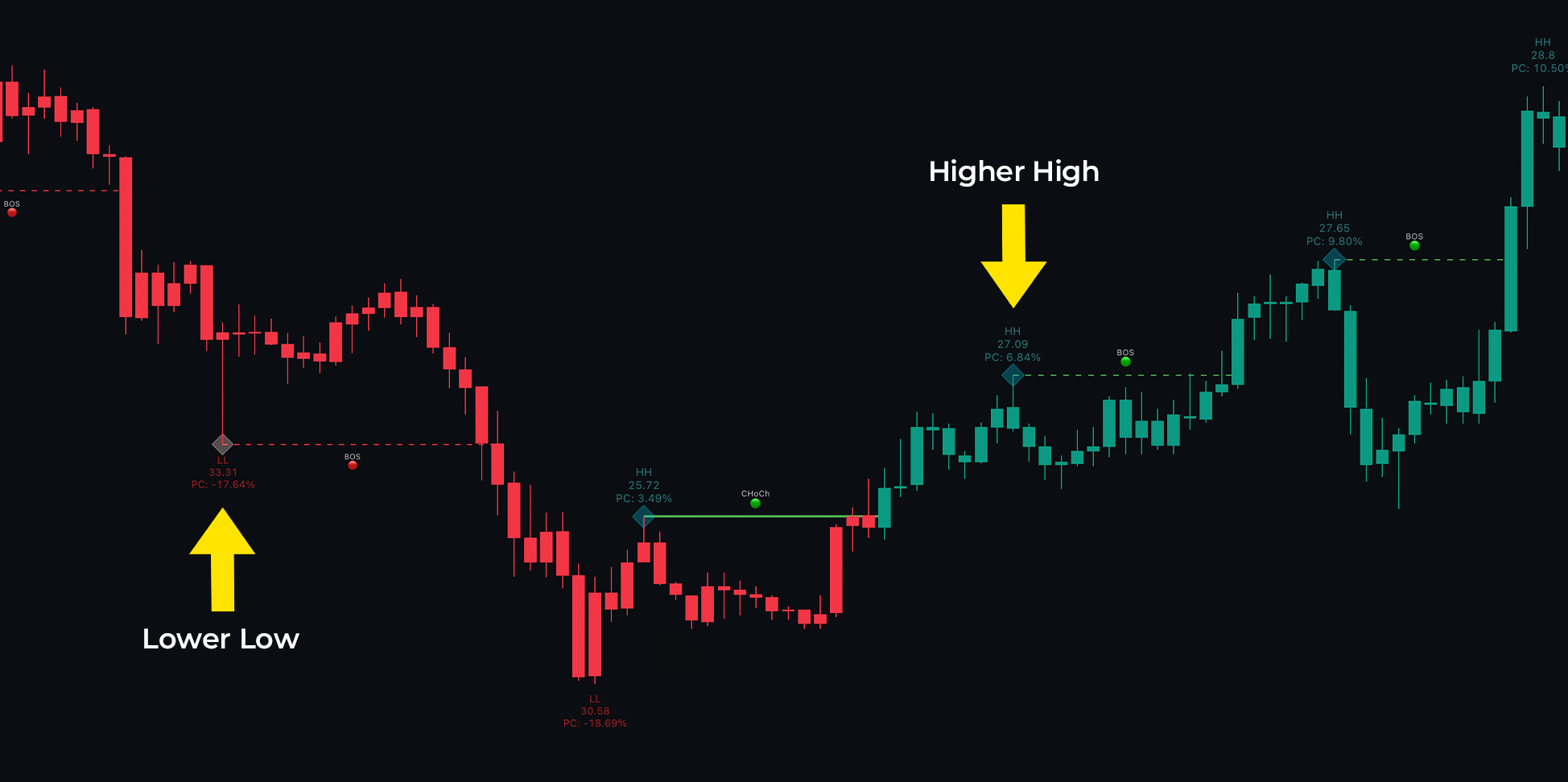
Classical market swing points are clearly labeled on the chart using the HH (Higher High) and LL (Lower Low) labels. An HH label indicates that the market has made a higher high, suggesting a continuation of the upward trend. Conversely, an LL label shows that the market has made a lower low, indicating a potential continuation of the downward trend. The price at each pivot point is displayed, which can serve as a support/resistance level or a future take-profit area.
A full explanation of market structure labels is provided below:
The PC at each of these HH or LL labels represents the percentage change between these points, which can be an interesting metric to observe. A higher or abnormally high value suggests a strongly trending market that may need to cool off, while a low value may indicate a ranging market that could explode at any moment.
 |
|---|
| Market Structure Labels |
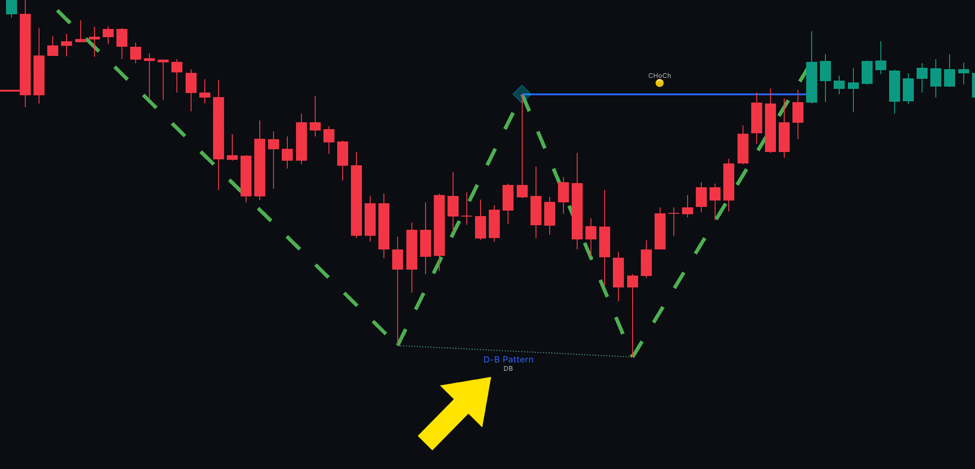
Double Top and Double Bottom patterns are also labeled as market structures. Commonly referred to as M or W patterns, these signify reversals in the market. When the price revisits a similar area twice, it is hypothesized that a reversal may occur from that level. In Market Dynamics Pro, this is displayed using DT (Double Top) or DB (Double Bottom) labels.
 |
|---|
| Double Bottom Label |
These DT and DP labels are not 100% real-time and may be delayed by a few bars. This is because you cannot know a top has occurred until it has occurred.
Settings on Market Structures
Users can adjust the length of these market structures to change their sensitivity to potential market moves. A higher value filters out more noise, while a lower value is more sensitive. Traders will also notice internal and swing options in the settings. Internal market structures simply operate on a lower length and are more sensitive to market moves whereas swing are more macro structures in the market.
Candle Coloring
Next to the market structure inputs there is a MSC check box. Enabling this turns on candle coloring according to candle structures.
 |
|---|
| Market Structure Candle Coloring Settings |
Using this feature to follow market trends can provide powerful confirmation and a clearer overview of SMC (Smart Money Concepts) compared to labels on a chart. When using this, we suggest “bringing the indicator to the front” to enhance the visibility of candle coloring. This can offer unique advantages, as the distinct candle colors (rather than gradient colors) are ideal for rule-based entries.